Overview:
- Profit and Loss report
- Actual vs Budget report
- Accounts Payable report
- Accounts Receivable report
- Cashflow Insights report
- Commitment report
Why Use Wiise Financial Dashboards in Power BI?
Wiise Financial Dashboards in Power BI give you real-time visibility into your business’s financial performance through key metrics. These metrics help you make efficient, informed decisions by consolidating financial data into interactive reports and visual insights.
Before you Begin:
- Make sure that Wiise Dashboards are installed and connected to Power BI.
- When you access the Profit and Loss or Actual vs Budget reports, you can select various date ranges. Select the Period drop-down to select the date range for your Profit and Loss or Actual vs Budget report:
- This week: From the first day of the week to today.
- This month: From the first day of the current month to today.
- This quarter: From the first day of the quarter to today.
- This fiscal year: As set up in Wiise (default: 1 July to 30 June).
- This calendar year: From 1 January to today.
- Budget name: When you’ve created a budget in Wiise, you can select the budget to compare against actuals. Select the Budget name drop-down to apply a budget on your Profit and Loss or Actual vs Budget reports.
Tip: To navigate any dashboard, you can hover for tooltips and drill through details.
How to Use Wiise Financial Dashboards in Power BI?
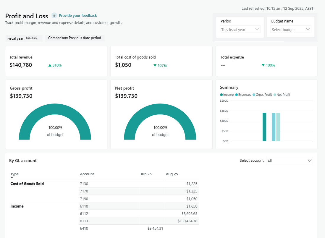
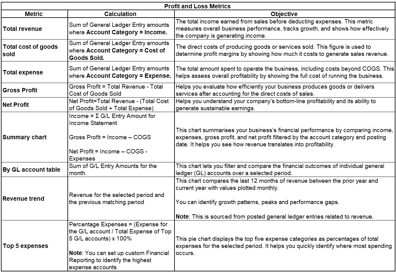
1. Profit and Loss
- Select the Profit and Loss menu. The Profit and Loss Power BI reports display.

- Here’s how to read and understand the tiles on the Profit and Loss report metrics:

- You now know how to use the Profit and Loss report in Power BI.
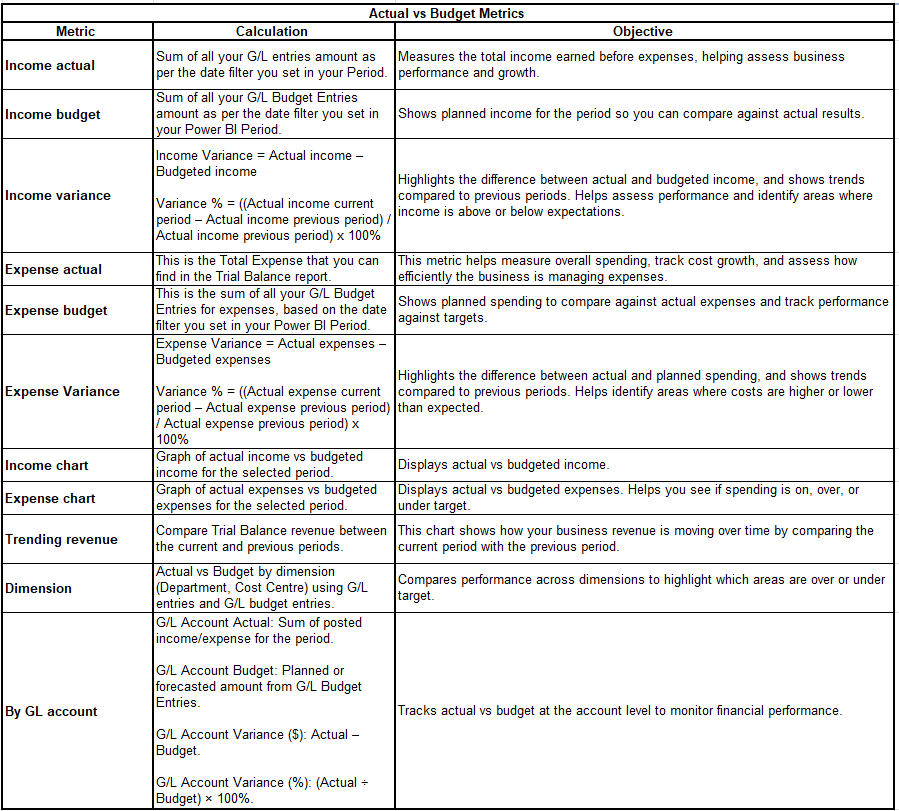
2. Actual vs Budget
- Select the Actual vs Budget menu. The Actual vs Budget Power BI reports display.

- Here’s how to read and understand the tiles on the Actual vs Budget report metrics:

- You now know how to use the Actual vs Budget report in Power BI.
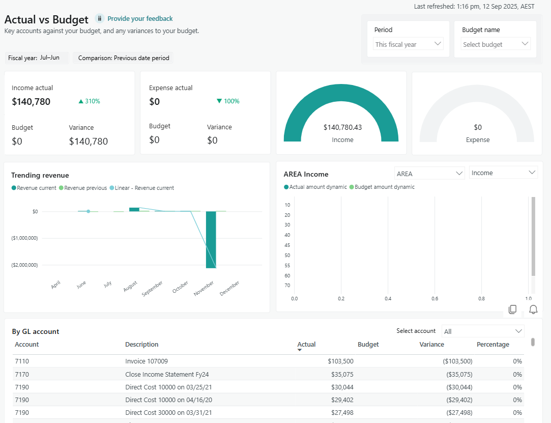
Note: The variance percentage rate is shown in red or green to indicate change compared to the previous period. Green indicates a favourable change, while red indicates an unfavourable change.
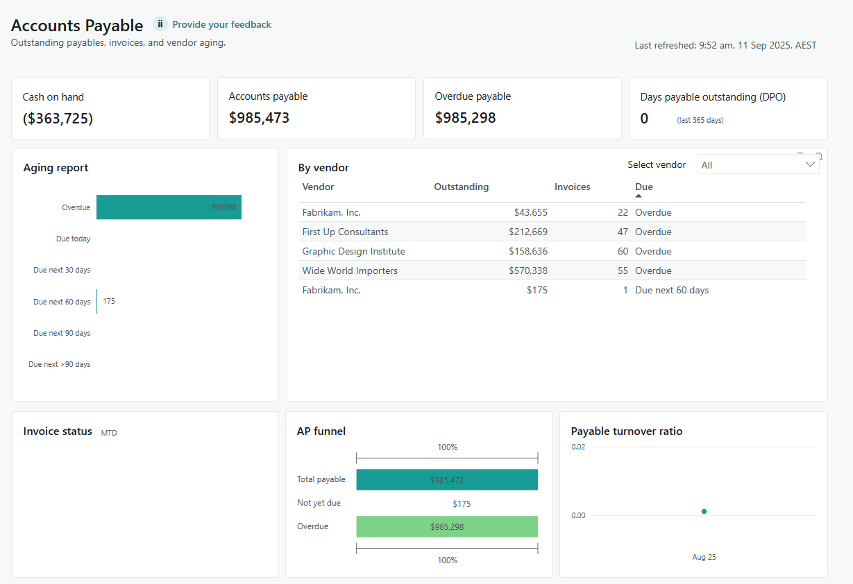
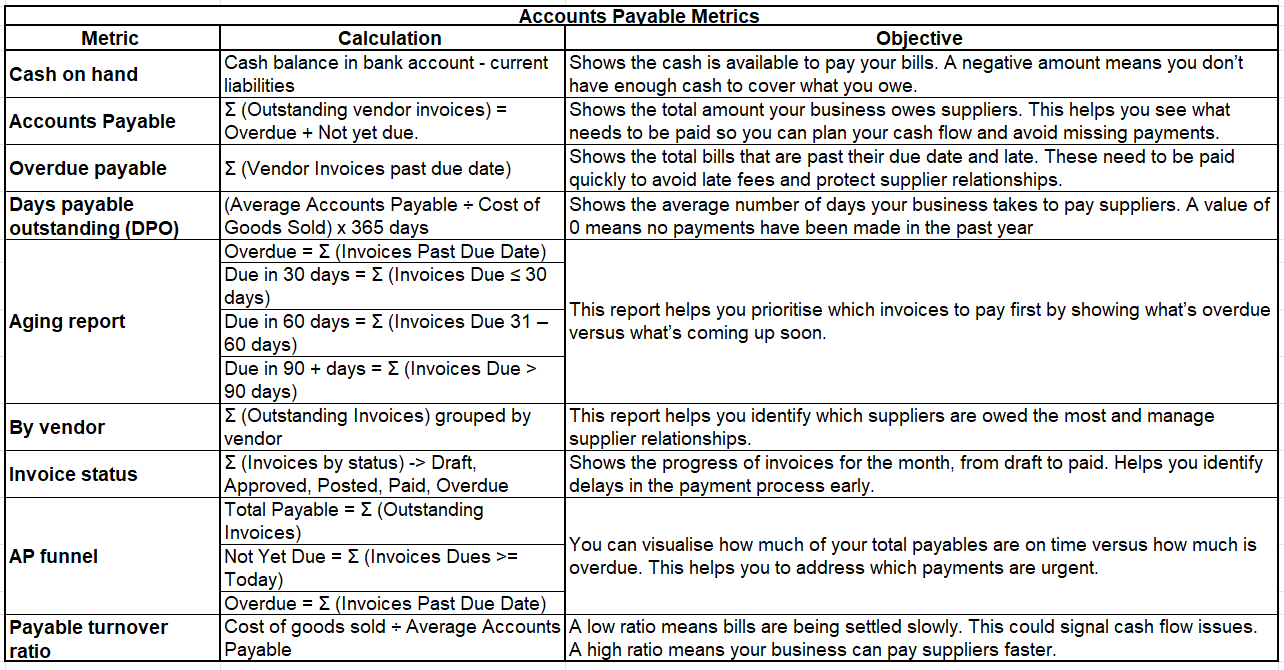
3. Accounts Payable
- Select the Accounts Payable menu. The Accounts Payable Power BI reports display.

- Here’s how to read and understand the tiles on the Accounts Payable report metrics:

- You now know how to use the Accounts Payable report in Power BI.
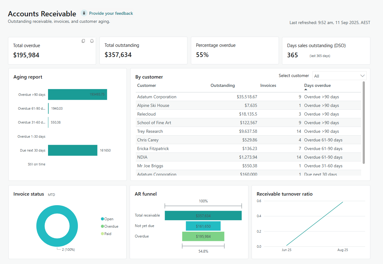
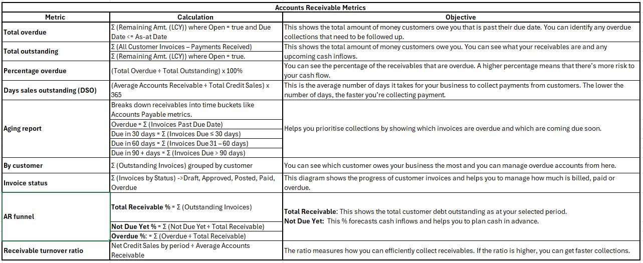
4. Accounts Receivable
- Select the Accounts Receivable menu. The Accounts Receivable Power BI reports display.

- Here’s how to read and understand the tiles on the Accounts Receivable report metrics:

- You now know how to use the Accounts Receivable report in Power BI.
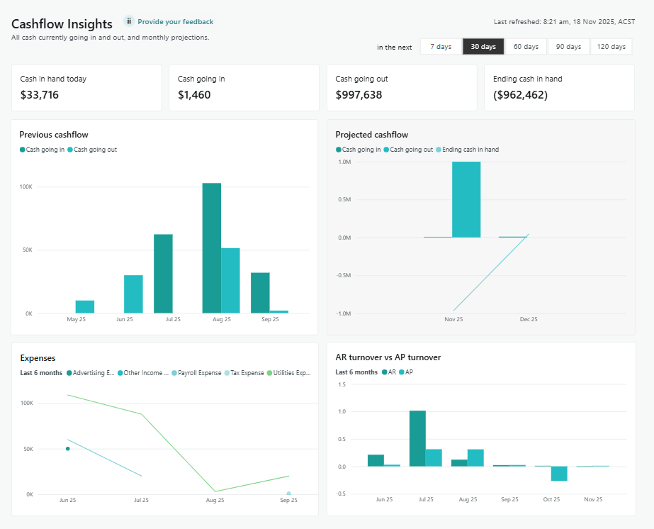
5. Cashflow Insights
Use this dashboard to monitor liquidity, assess financial health, and plan for upcoming cash needs.
- Select the Cashflow Insights menu. The Cashflow Insights Power BI reports display.

Note: You can view insights for the next 7, 30, 60, 90 or 120 days for the four metrics on the top panel which are:
- Cash in hand today
- Cash going in
- Cash going out
- Ending cash in hand
Note: Cashflow Insights is designed to report actual cash movement. This means the Cash going in and Cash going out tiles do not use applied entries when calculating inflows and outflows, as applied entries do not change the bank balance.
Note: The other metrics on the dashboard which are Previous cashflow, Projected cashflow, Expenses, and AR turnover vs AP turnover, are based on results covering the past six months, and reflect historical patterns or averages over that period.
|
Cashflow Insights Metrics |
||
|
Metric |
Calculation |
Objective |
|
Cash in hand today |
Cash balance in bank account - Current Liabilities |
Shows how much cash is available right now across all bank and cash accounts so you can see your true liquidity at a glance. |
|
Cash going in |
Sum of Remaining Amount (LCY) on open Customer Ledger Entries with Due Date in the selected period. |
Estimates future cash inflows from customers over the selected period so you can see how much cash is expected to arrive. |
|
Cash going out |
Sum of Remaining Amount (LCY) × –1 on open Vendor Ledger Entries with Due Date in the selected period |
Shows total outgoing cash for the selected period such as vendor payments, salaries, rent, and other expenses. |
|
Ending cash in hand |
Cash in hand today + Cash going in − Cash going out |
Shows your closing cash position at the end of the selected period |
|
Previous cashflow |
From Bank Account Ledger Entries Cash In = Sum of Debit Amount Grouped by month for the last 6 full months (plus current month to date). |
Shows actual historical cash movement each month so you can compare past inflows and outflows and spot trends in cash usage. |
|
Projected cashflow |
Based on open Customer and Vendor Ledger Entries for the next six months (including the current month): Projected Cash In = Sum of Customer Remaining Amount (LCY) Projected Cash Out = Sum of Vendor Remaining Amount (LCY) x –1 Amounts are grouped by month using the Due Date (current month starts from tomorrow to month-end, then full months after). |
Provides a month-by-month forward view of expected cash in and out so you can plan for upcoming surpluses or gaps. |
|
Expenses |
From G/L Accounts where: Type = Posting Then from General Ledger Entries for those accounts: Sum of Amount per month over the last 6 months (including current month). |
Shows actual monthly expenses by major cost type, helping you understand where cash is being spent and control operating costs. |
|
AR turnover vs AP turnover |
Measured over the last 6 months, plotted by month. AR Turnover Total Credit Sales / Average Accounts Receivable Total Credit Sales = Sum Cust. Ledger Entry.Amount (Posting Date in month, Payment Method ≠ CASH) Average AR = (Opening AR + Closing AR) / 2, based on Remaining Amount on open customer entries. AP Turnover Total COGS / Average Accounts Payable Total COGS = Sum G/L Entry.Amount for COGS accounts in the month Average AP = (Opening AP + Closing AP) / 2, using Remaining Amount × –1 on vendor entries. |
Compares how quickly you collect from customers (AR) versus how quickly you pay suppliers (AP), helping you assess the health of your working capital and payment practices. |
- You now know how to use the Cashflow Insights report in Power BI.
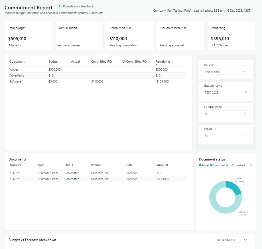
6. Commitment Report
This report helps you gain full visibility into budgets and purchase commitments.
Before you Begin:
-
Select the Period drop-down to select the date range for your Landed Cost report:
-
This week: From the first day of the week to today.
-
This month: From the first day of the current month to today.
-
This quarter: From the first day of the quarter to today.
-
This fiscal year: As set up in Wiise (default: 1 July to 30 June).
-
This calendar year: From 1 January to today.
-
- Select the Commitment Report menu. The Commitment Report Power BI reports display.

Commitment Report Metric Calculation Objective Total budget Sum of GL Budget Entry Amount for expense accounts in the selected budget and date range. Show the total planned spend for operating expenses so finance can compare against all commitments and actuals. Actual spent Sum of General Ledger Entry Amount for expense accounts in the selected date range. Show what has already been spent so users see how much of the budget has been consumed. Committed POs Sum of Purchase Line Amount Including VAT where Type = G/L Account and Document Type = Order or Invoice. Show spend that is contractually committed on purchase orders and invoices but may not yet be posted to the general ledger. Uncommitted POs Sum of Purchase Line Amount Including VAT where Type = G/L Account and Document Type = Quote. Show potential or requested spend that is not yet committed, so approvers can see what is in the pipeline. Remaining Remaining = Total Budget minus Actual Spent minus Committed POs minus Uncommitted POs. Show how much budget is still available after considering actual, committed and uncommitted spend. GL account breakdown Budget by GL account Sum of GL Budget Entry Amount grouped by G L Account No. Show budgeted spend per account so users can drill into where budget is allocated. Actual by GL account Sum of General Ledger Entry Amount grouped by G L Account No. Show actual spend per account for detailed variance analysis. Committed by GL account Sum of Purchase Line Amount Including VAT for Orders and Invoices grouped by G L Account No. Show committed purchase orders and invoices per account. Uncommitted by GL account Sum of Purchase Line Amount Including VAT for Quotes grouped by G L Account No. Show unapproved or draft spend requests per account. Remaining by GL account Remaining = Budget minus Actual minus Committed minus Uncommitted for each account. Highlight which accounts are overspending or underspending against their budget. Documents list and status Documents For each distinct Document No from Purchase Lines and General Ledger Entries, show Number, Type, Status and Amount. Provide a single place to review all spend related documents that make up the commitments and actuals. Document status breakdown Status % = Number of documents in a given status (Actual, Committed, Uncommitted, Remaining) divided by total number of documents multiplied by one hundred. Show the mix of spend that is actual, committed or still uncommitted to support approval and planning decisions. Budget vs commitments by dimension Metric Calculation Objective Budget by dimension Sum of GL Budget Entry Amount grouped by selected dimension value (Global Dimension 1 or 2). Show how budget is allocated across cost centres, departments, projects or other dimensions. Commitment by dimension Commitment = Actual plus Committed plus Uncommitted, grouped by selected dimension value. Show total exposure against the budget per dimension, including actual and all levels of commitment. Actual by dimension Sum of General Ledger Entry Amount grouped by selected dimension value. Show realised spend per dimension for performance tracking. Committed by dimension Sum of Purchase Line Amount Including VAT for Orders and Invoices grouped by selected dimension value. Show purchase commitments per dimension. Uncommitted by dimension Sum of Purchase Line Amount Including VAT for Quotes grouped by selected dimension value. Show pipeline requests per dimension for forecasting and approvals. - You now know how to use the Commitment Report in Power BI.
Note: Each Wiise Power BI dashboard includes a Provide your Feedback link. When you select it, a new tab opens where you can easily share your thoughts on the dashboard.
What’s next?
Find out how to refresh your Power BI dashboards.
Need more help?
No problem, that's what we're here for. Reach out to support@wiise.com anytime you can't find what you're looking for.